Time for fresh quote of paints on InsuredMine application, making it more vibrant, intuitive with better customer experience. Introducing the new Insuredmine UI (user interface) for fluid product experience and excellent design. Our integrated technology helps you sync better with your AMS (Agency Management System) more intuitively and in lesser time. The systematic organisation of your favorite tools in a distinct view and easy navigation enable efficient utilization of your time.
The new-look has soothing colors. Glide smoothly through Insuredmine cloud and check what’s changed! Dig deeper into the new additions of each module. Know more with the complete changelog mentioned below:
1.Dashboard
- The dashboard just got a smart 3 dots spinning loader icon replacing the old ring icon.
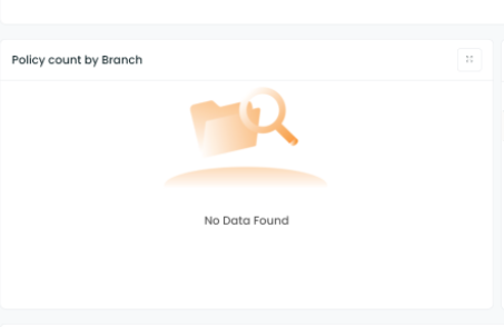
- Vector illustration for the records not found in any widget.
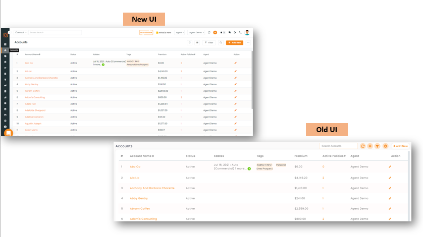
2. Accounts
- Accounts now present a clear view as the grid lines don’t appear anymore.
- When you click account name to enter Accounts 360. The page title now displays Accounts 360> Account Name instead of Accounts > (Account Name).
- Account info highlights in bold letters the Account Name
- + icon towards top right corner in the Contacts segment of Accounts 360, is replaced by, +Add New button. You will also notice a subtle change in the majority of icons, they have light pink or white background elements replacing the orange box.
- The phone number in contacts has a simple 10 digit format replacing the (111)-111-1111 format.
- Contracted Customer 360 view. You can click it open, by just tapping on Customer 360, whenever you need to work on contact and access details of the client. This makes the overall Account 360 experience precise and compact.
- If your browser window is in minimized view , Action column in contacts, appears towards the right end in any setting. You need not scroll to the right end for performing any action every time, while working in the cascade mode.
A comparative view of the Accounts module now and earlier is shown below.
3. Contacts :
To Add- On scrolling the list right, the account detail is now clickable and will redirect to the clicked Accounts dashboard.
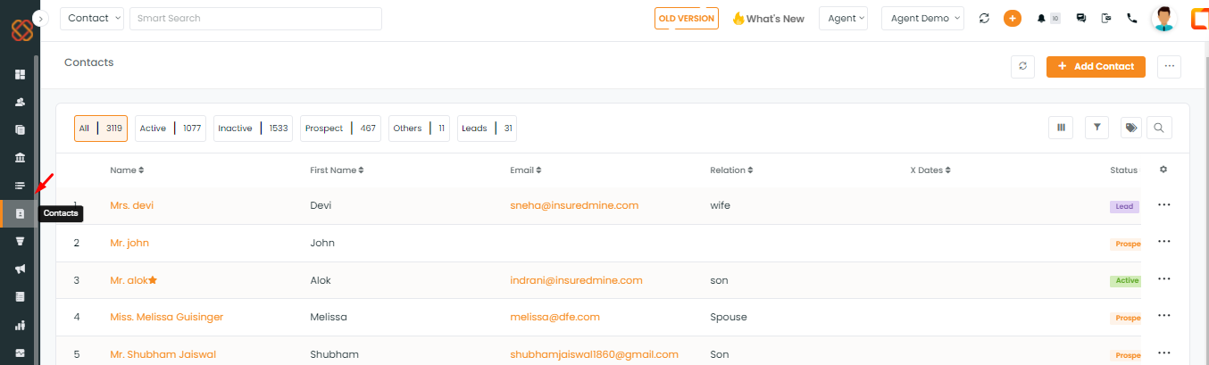
- Adding contacts is easy with a prominent +Add new button at top right. It pops open a screen with a single scroll view. No more Save and skip to jump screens for entering additional details.
- Tab clicks for Contact lists (All, Active Inactive Prospect and Leads) have been replaced by radio buttons.
- Filters UI has a much more clear view of the checkboxes. Its options are also displayed in a bigger font size.
- On clicking the Contact Name, Contact profile can be seen in an elaborate format with graphic images like that of a business card instead of a simple tabular display.
- Customer 360: Customer 360 view is placed below the contact profile. You can click it open, by pressing the down arrow icon, whenever you need to access details or perform actions related to the contact.
- There are a couple of minor changes in the Overview segment of Customer 360 . Notifications are now accessible through the bell icon. Radio buttons appear instead of Tabs for By Me and By others in the right corner of Policy Information. Policy type drop down added in place of list segments for Active and Expired Policies.
- The Events section has got a new look too. All the tabs are smart buttons now. The options under the Past segment of events are vertically aligned for enhanced and organized view.
- The Policy categories under Other details are seen as Radio buttons now.
- Search option is available in Chat history, located at the top right corner of the chat history segment.
- View Campaigns lists for each category by clicking on the radio button for the respective campaign type i.e., Single Contact Drips, Email campaign and Workflows.
5. Pipelines
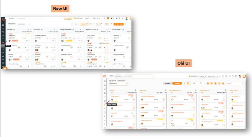
- Now Pipeline Manager is named as Pipelines.
- List view columns of cards have an expanded view sliding option instead of radio buttons.
- When you choose a compact view, now a 3 dot icon appears instead of a click-able left arrow icon in each deal card for quick access to email or call actions.
- Pipeline Cards display options in a drop-down when you click the 3 dots on the card. Earlier you could just see icons lined up at the bottom of the card. View the card comparison shown below with left indicating New and right representing Old.
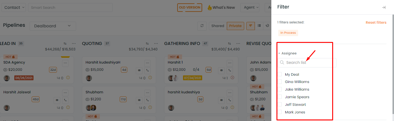
- Filters can be Navigated for quicker access. You can also search for an assignee name, by clicking Assignee tab and entering the query in the Search list fill box.
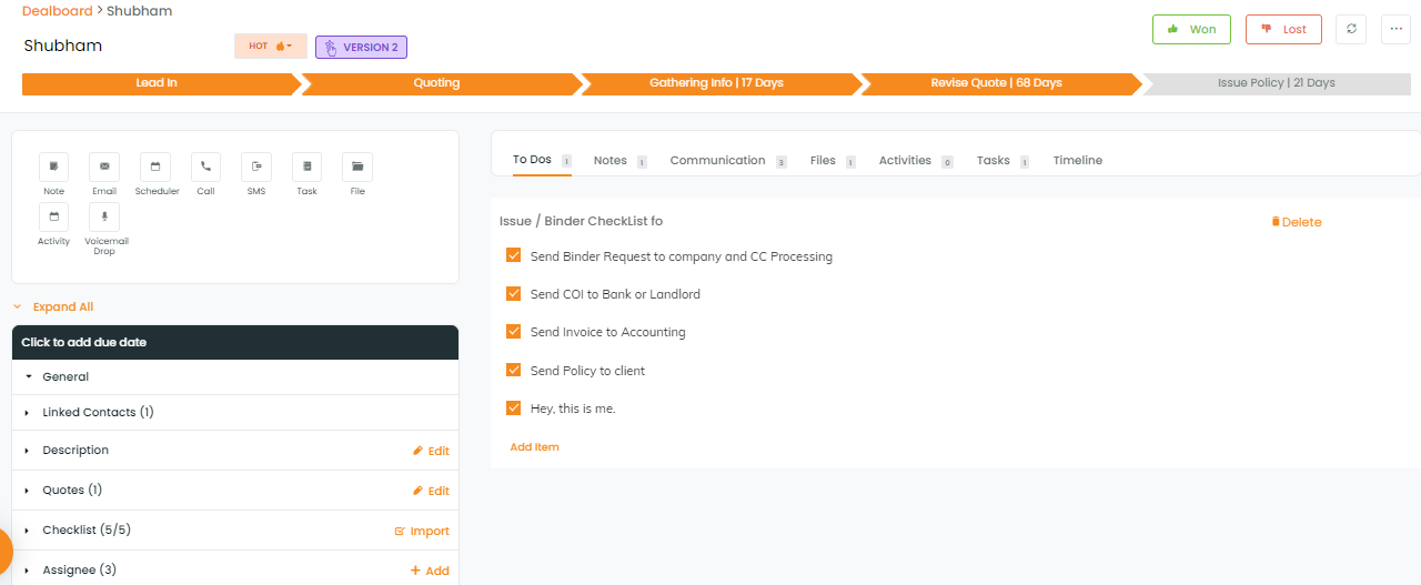
- Interface for the expanded Pipeline Deal card also reflects many changes, displaying a compact clean view. You will find the changes mentioned below:
- Deal title, Contact Name, Deal category, Expected Premium, Broker fee, all are available in the left panel and Won and lost are located at the top right.
- Actionable field categories are in place for compact and overall navigation flexibility.
- Quick actions category added on the left side consolidating the action icons in distinct view.
5. Opportunities:
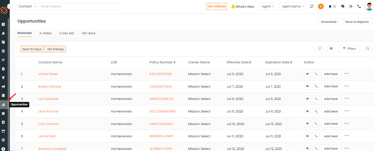
The vector graphics for each segment have been recreated to convey a meaningful representation of every opportunity you may explore.


